
The Singapore Management University (SMU) places a high priority on developing and maintaining a consistent corporate image in order to reinforce its status and position, both in the local and wider communities.
Our brand is much more than a series of words, or a logo. It embodies what SMU is all about; it tells people who we are, what we stand for, and what we offer. Why do we care about the SMU brand? This is primarily because a good brand creates opportunities to fulfil SMU’s vision. It encourages students to consider SMU, donors to contribute to our worthy causes, and our communities (geographical, professional and ideological) to support our initiatives.
SMU Vision 2025 has been pivotal to our University’s strategic directions, giving us added impetus to innovate and stay a forerunner in the tertiary education sector, and contribute to Singapore and beyond.

Personality is what makes us recognisable to others. It’s not just what we do but the way in which we do it. Our personality is the way we express ourselves outwardly and these traits are important tools in helping us identify and frame the content of our communications.
The SMU Brand Personality is the combination of characteristics or qualities that form our distinctive character.
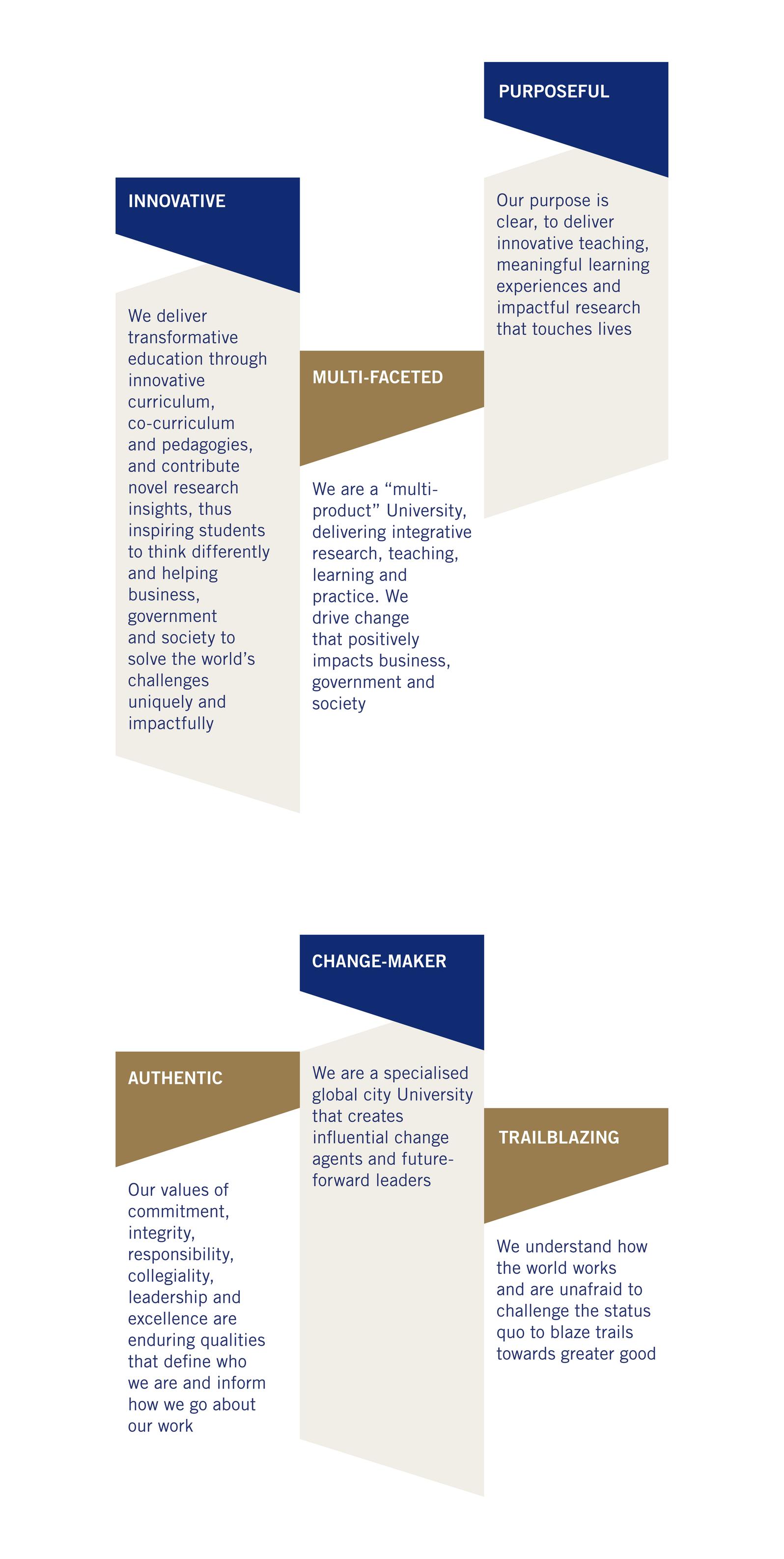
Personality and purpose go hand-in-hand, and what we interpret as meaningful is shaped by who we are as an institution and the values that we share.
In our communication, the SMU brand personality is best expressed through the tone of voice and imagery we select, and this should be centred around the proposition of Meaningful Impact.
In a Visual Identity System, several design elements work together to form a strong set of tools to ensure a consistent and unique look for a brand. Together, these elements are referred to as the Key Design Elements.
Each element is designed to contribute to a holistic system that strongly reflects the brand. While each element creates visual impact on its own, they combine to create a look that is uniquely SMU. The section will describe each of these elements in detail.
The Symbol
SMU’s majestic Tangram Lion‚ represents Leadership, Strength, Dignity, Wisdom and Loyalty. The Lion Symbol is the father figure who provides wisdom and guidance, reflecting the country’s original name of Singapura or Lion City. His face is described through a stylised tangram (a Chinese ‘wisdom puzzle’ made up of seven triangular pieces). The Symbol has been meticulously created to convey the University’s position at the forefront of tertiary education in business, technology, and social sciences, and in strategic partnership with leading universities overseas.
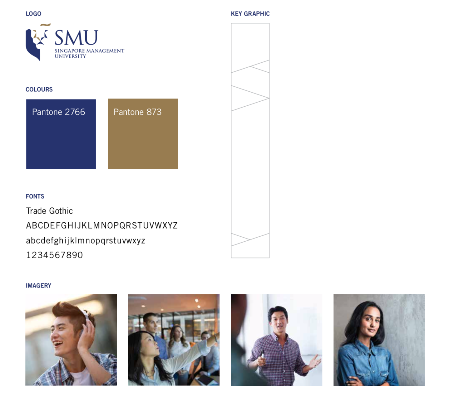
The Colours
The deep blue is strong and classic. It is legible and authoritative; conveying a sense of clear direction of this powerful, stable colour. It is cool, confident and dignified. The use of gold in the identity brings in a combination of richness and lightness. It is also a counterbalance to the dark blue. Gold is at the opposite end of the colour spectrum to dark blue. As such, the colours complement each other. The combination of these two colours also reflects Singapore’s history as a mercantile trading seaport, Gold for Wealth and Blue for the Sea that makes it possible.

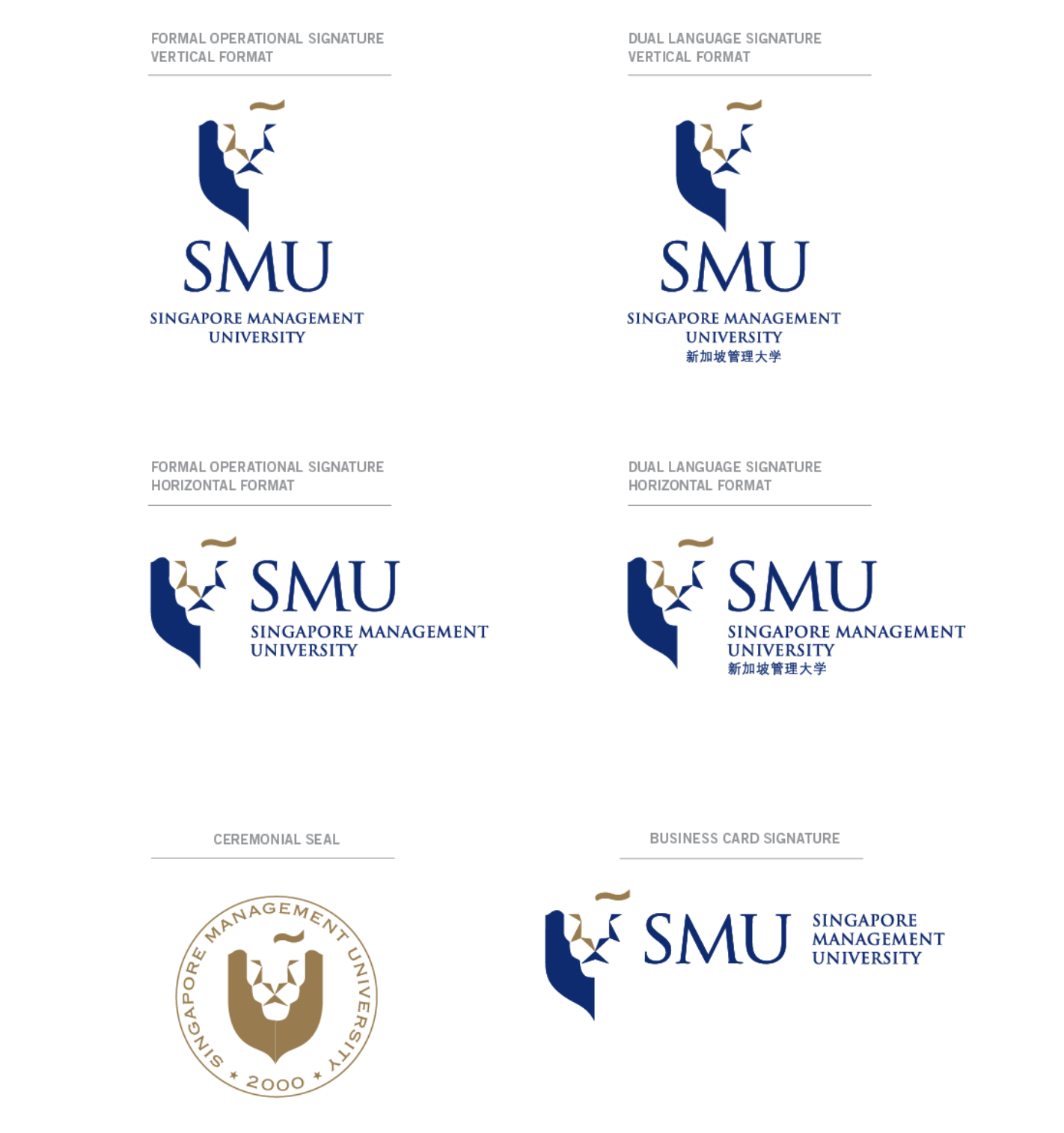
SMU Signature Family
Overview
Corporate Colours
Corporate Colours play an important role in projecting a recognisable brand identity for the University. Use of the two corporate colours is critical when reproducing the University Signature. These are henceforth known as:
SMU Blue
#151C55
21, 28, 85
100, 94, 0, 47
100, 94, 0, 47
SMU Gold
#8A704C
138, 112, 76
40, 50, 80, 10
40, 50, 80, 10
White
#FFFFFF
255, 255, 255
0, 0, 0, 0
SMU Blue
The deep blue colour is strong and classic. It is legible and authoritative; conveying a sense of clear direction of this powerful stable colour. It is cool, confident and dignified.
SMU Gold
The use of gold in the identity brings in a combination of richness and lightness. It is also a counterbalance to the dark blue.
Gold is at the opposite end of the colour spectrum. As such the colours complement one another.
School Colours
Each of the schools within the University has its own official colour to visually identify it. These are critical when reproducing the School Signatures:
SOA
#9E0040
158, 0, 64
0, 100, 60, 37
LKCSB
#005C96
138, 112, 76
100, 50, 0, 10
SOE
#006685
0, 102, 133
100, 0, 12, 43
SCIS
#C69200
198, 146, 0
0, 28, 100, 18
YPHSOL
#330066
51, 0, 102
77, 100, 0, 31
SOSS
#006633
0, 102, 51
100, 0, 78, 42
Thematic Clusters Colours
Life Lessons
#00A5DB
0, 165, 219
SMU X
#A3057F
163, 5, 127
Community
#D81C3F
216, 28, 63
Wellness
#F96302
249, 99, 2
Green
#7FBA00
127, 186, 0
One of the key factors in the visual system is the use of the typestyle for text or running copy. Using a consistent family of typefaces visually reinforces the identity of SMU. The typefaces selected here are as much for their legibility as for their significance in specific uses.
Corporate Typeface
Trajan is the main font used in conjunction with the Singapore Management University Signature. It has a classical appeal yet conveys a contemporary look.
Trade Gothic is the font used for applications. Trade Gothic is the supporting sans serif font used in general text applications. It is recommended for use as a body text in brochures and printed collateral and approved for advertising, print, stationery address blocks, and tagline. Trade Gothic in its variant forms (Roman, Bold No.2, Oblique) may also be used for general office administrative purposes for example; namecards, faxes or memos.
SMU Vision 2025 has been pivotal to our University’s strategic directions, giving us added impetus to innovate and stay a forerunner in the tertiary education sector, and contribute to Singapore and beyond.

Last updated on 27 Dec 2021.